How to evaluate creative work

How to evaluate creative work

How to evaluate creative work: a guide for non-designers on how to give useful, constructive feedback

The designer presents their work. You study it carefully. Something isn’t quite landing — but you’re struggling to put your finger on what. You say “it’s not quite right” or “can you make it pop more?” The designer nods, takes notes, and returns with revisions. And somehow, it’s still not there.

This is one of the most common friction points in a client–designer relationship, and it almost always comes down to a communication breakdown rather than a failure of design or intent on either side. At a studio like ours, a significant part of the early project process is spent immersing ourselves in a client’s business — understanding their audience, their competitive environment, their tone of voice, and the context in which their communications will land. That groundwork matters enormously. But even the deepest studio immersion has a limit: there are things only the client can know, and things only the designer can see. When those two bodies of knowledge connect clearly, the work improves rapidly. When they don’t, the revision cycle stretches out and the final result can end up being a compromise rather than an ideal solution.

The good news is that giving useful creative feedback is a learnable skill. Here’s how to approach it.

Understand your role in the process

Your job when evaluating creative work is not to art-direct — it is to assess whether the work achieves the objective it was designed to meet. Those are very different things.

A designer brings visual expertise, knowledge of composition, typography, colour theory, and print or digital production. What they don’t have, and can only learn through you, is your intimate understanding of your audience, your competitive landscape, and the nuances of your brand’s personality. The best creative outcomes happen when both of those knowledge sets are in genuine dialogue.

It helps to draw a distinction early between objective and subjective responses. “I don’t personally like orange” is a subjective response — valid, but not necessarily relevant. “Orange doesn’t align with how we want our brand to be perceived by our audience” is an objective one, grounded in strategy. Learning to notice which type of response you’re having is the first step toward more useful feedback.

Return to the brief

Before reacting emotionally to what’s in front of you, go back to what was agreed at the outset. What was this work supposed to achieve? Who is it talking to? Where will it live — on a billboard, a social media tile, a brochure cover, a trade exhibition wall?

Ask yourself:

  • Does the work communicate the right message to the right audience?
  • Does it reflect the brand’s tone, values, and visual identity?
  • Does it function effectively in the context it will actually be used?

Evaluating work against the brief grounds your feedback in the agreed objectives rather than in the moment of first impression, which is rarely the most reliable guide. If there was no formal brief for the project, this is an important signal that one should be established before the next project begins. Writing a thorough design brief takes time upfront but saves considerably more time — and miscommunication — downstream.
Learn to read the structure beneath the design

Before responding to how a design looks, it helps to observe how it is built. Every professional layout contains structural decisions that are intentional, and developing even a basic awareness of these elements can help you move from “something feels off” to a far more useful and specific description.

Grid systems form the invisible architecture of a layout. Designers use underlying grids to govern column widths, margins, and the alignment of every element on a page or screen. A design that feels disordered or restless may have a grid issue — or may be deliberately breaking the grid for creative effect. Either way, understanding that there is a structural logic at work helps you engage with it more precisely.

Negative space — the empty areas within a composition — is not wasted space. It is an active design element that gives the eye room to rest, creates emphasis around key content, and prevents visual overload. If a design feels cluttered or overwhelming, the problem is often insufficient negative space rather than a need to add more elements. In fact, the instinct to fill every available area is one of the most common sources of tension between clients and designers.

Eye movement and layout hierarchy are perhaps the most immediately useful concepts for non-designers to grasp. A skilled designer guides the viewer’s eye through the layout in a deliberate sequence — typically from the dominant visual element to the headline, through supporting information, to a call to action. As you look at a design, ask yourself: where does my eye go first? Where does it go next? Does that sequence serve the message the work is trying to communicate? If your eye is drawn immediately to a secondary element, or if it wanders without settling, the hierarchy may need attention.

Separate personal taste from strategic judgement

This is the hardest skill for non-designers to develop, and arguably the most valuable. Personal taste is a legitimate part of being human — but it is rarely the right lens through which to evaluate work that is designed to speak to an audience that is not you.

The distinction becomes clearer when you compare taste-based feedback with strategy-based feedback side by side:

  • ✗ “I just don’t like that font” → ✓ “The typeface feels too casual for the professional audience we’re targeting”
  • ✗ “Can you make it more exciting?” → ✓ “We need to convey urgency — the current layout feels static”
  • ✗ “It needs to pop more” → ✓ “The hero image isn’t drawing the eye toward the call to action”
  • ✗ “It feels cramped” → ✓ “There isn’t enough negative space around the headline — it’s competing with the body copy for attention”

Notice that in each case, the revised version says the same thing in essence — but gives the designer something they can actually work with. The most useful question to ask yourself before offering feedback is not “do I like this?” but “would our target customer respond well to this, and does it serve the brief?”

Give specific, actionable feedback

Vague feedback generates vague revisions, and the cycle repeats. The most productive feedback answers three things: what the issue is, where specifically it occurs, and why it matters in the context of the brief or the audience.

Annotating proofs directly — whether through PDF commenting tools or a shared document — is far more effective than verbal-only feedback, which is easily misremembered or misinterpreted. If you’re marking up a layout, point to the specific element, describe the concern, and explain the strategic reason behind it.

Equally important: consolidate feedback from all internal stakeholders before sending it through. One of the most disruptive things that can happen to a project is receiving conflicting direction from multiple voices at different points in the revision process. A marketing manager who approves a direction on Monday and a general manager who overturns it on Wednesday creates significant rework — and erodes the trust and momentum that good creative collaboration depends on. Working effectively with your design team means establishing a single point of contact and a clear internal sign-off process before the project begins.
When something feels wrong but you can’t name it

Sometimes your instinct is telling you something is off, but your vocabulary for articulating it isn’t there yet. That’s completely understandable — visual communication is a discipline that takes years to develop fluency in. The goal isn’t for clients to become designers; it’s simply to bridge the gap enough to have a productive conversation.

A few prompts that can help:

  • “The work makes me feel ___ but I think we want the audience to feel ___”
  • “Compared to [a competitor or reference example], this feels ___”
  • “My eye keeps going to ___ first — but I think it should go to ___”
  • “The part that isn’t sitting right for me is ___ — I think it might be because ___”

Sharing visual references is also genuinely useful, not as an instruction to replicate, but as a way of communicating a desired tone, feeling, or energy. And if you genuinely cannot articulate it, say so — and invite the designer into the problem. “I’m not sure what it needs; can we talk through it?” is a legitimate and productive response, and a good studio will welcome that conversation rather than treat it as a complication.

What good feedback looks like in practice

To make this concrete, consider the difference between these two pieces of feedback on the same piece of work:

Before: “The design looks a bit flat and corporate. I want something fresher.”

After: “We’re targeting a younger demographic — 25 to 35-year-olds — who tend to associate our competitors with old-fashioned, conservative institutions. We want the design to feel contemporary and approachable. Something lighter, with more breathing room, and perhaps a less formal typeface. We’re open to how you interpret that.”

The second version communicates the same underlying concern but gives the designer a clear strategic destination, a defined audience, a competitive frame of reference, and creative latitude to find the solution. It opens a dialogue rather than closing one down.

The feedback loop as a creative investment

Good feedback is a skill that improves with practice, and one that pays dividends across every project you work on. Designers genuinely welcome considered, specific feedback — it is the raw material they need to get the work right, and the foundation of a relationship that gets stronger and more efficient over time.

The goal that both sides share is the same: work that performs well in the world, that speaks clearly to the right people, and that reflects well on the brand behind it. When client knowledge and design expertise connect through clear communication, revision rounds shorten, timelines hold, and the final result is something both parties are genuinely proud of.

If you’re about to start a new project and would like to talk through the briefing and feedback process before work begins, we’d welcome the conversation. Getting the foundations right at the outset is the most effective thing you can do for the quality of the outcome.
Design journeys

Design journeys

WHERE's ERIC!

by Kym Ramadge, May 2026.

One of the most rewarding aspects of a visual communication career – apart from the diverse and dynamic people I have had the privilege of working with – is the breadth of projects across a plethora of industries I’ve been involved with.

There are parallels between journalism and graphic design, where we learn about a multitude of sectors without ever deep diving, the way an academic would focus on one professional area of knowledge.

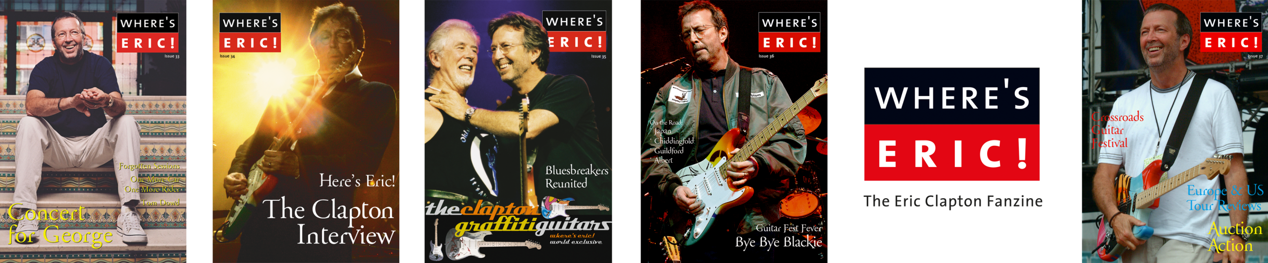
Where’s Eric! magazine

Ramblin’ on my mind

April 2020
28 years ago, I received a letter (you remember them) from a young graphic design student, offering her services in the design of this magazine. As she was based in Melbourne, Australia, I doubted it could possibly work, but she sent over A3 size spreads anyway and we just dropped them into the magazine from Issue 3. We worked together on and off for years and Kym Ramadge, for it is she, now runs her own highly successful graphic design studio. I am delighted to say she is back for us again and expertly designed this issue, putting up with the Virgoan idiosyncrasies of the Editor, plus late night/early morning WhatsApp calls.

As a young design student obsessed with all things Blues guitar, I spotted a small ad in a guitar magazine about a Where’s Eric! Fanzine. In 1992, before email adoption was ubiquitous, by the time I had seen the ad and written to the Editor in the UK, the first issue had been published. As Tony noted above in the April 2020 magazine intro, we have been working together on and off since then.

Starting out as a paste-up, photocopied fanzine, over the years the publication progressed first to colour cover and double spread inner, to the latest iteration, full colour throughout. As the world has evolved, the website and social channels have been added.

The current logo is an evolution of the original I designed in 1992.

Stand out moments

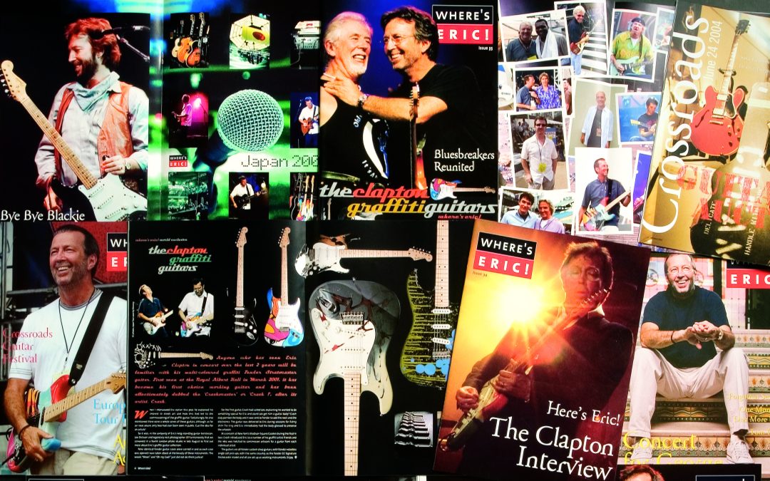
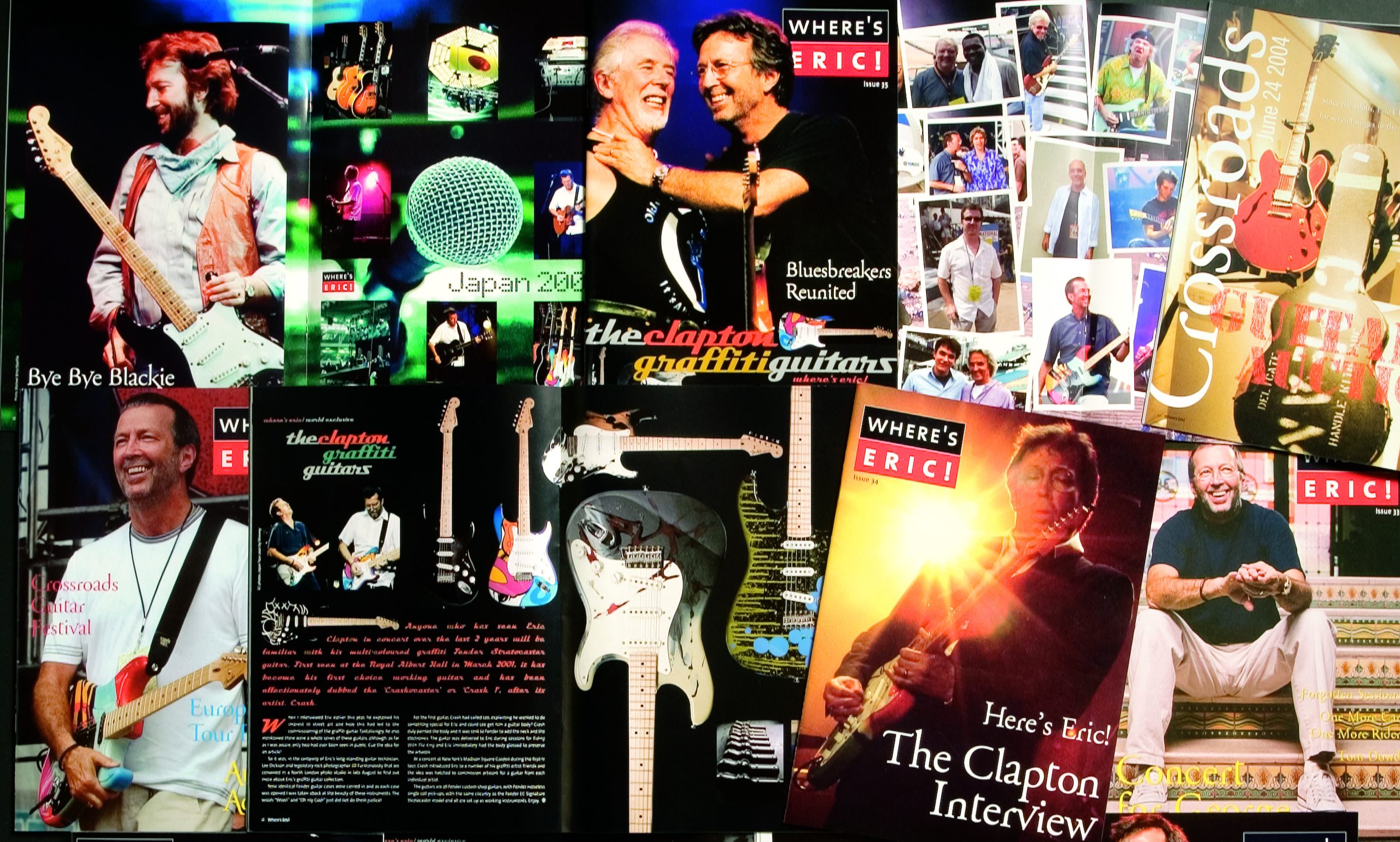
Through years of patience, quiet persistence and professional decorum, the Editor was rewarded with an exclusive in-person interview with EC in 2003. I had the honour of designing this issue (#34). Finding the right elements to present this with the gravitas and design flair it deserves consumed my spare time. One element included a spare electric guitar string coiled up, which I photographed and used as page highlight.

The following issue (#35) featured a special inner colour spread of the Clapton graffiti guitars. These are strikingly painted, individual artwork on each guitar, some of which were later auctioned off.

Issue 51 is another favourite. It features the beautiful 24 Nights artwork by Peter Blake. This simple, engaging linework retains a timeless eloquence, perfectly visually representing the music.

I have been in and out of the design role: Issues 33–37, Issues 41–42, the cover of Issue 46, then Issues 48– until the most recent, #54, are all magazines both myself and later, my team have been involved with designing.

Where’s Eric is a fun side-project for the studio, unbound by corporate brand guidelines and a welcome place for some whimsy, colour and quirky font choices. I’ve been friends with the Tony, the editor since 1992. We have continued a long-term musical journey together and explored many artists and genres beyond Blues and EC.

Now retired from his professional career, the Editor is working on rewarding philanthropic activities with Musically Fed, as well as continuing work on Where’s Eric!

On the Road with EC is a regular column. Design journeys travel unpredictable roads.

With special thanks to Tony Edser.

To learn more or subscribe to Where’s Eric!

The impact of technology on creativity: exploring new frontiers

The impact of technology on creativity: exploring new frontiers

Creativity and technology are intimately linked throughout time. Humans have always used the available technology to express their creativity, be it a cave painting or an intricately crafted Roman mosaic. Human history is divided into ages that vary depending on continent and culture, but in Europe loosely covers the stone age (various), metal age (various), Roman, Medieval, Post-medieval and the industrial/modern ages. Throughout all these ages, technological development has influenced creative output. Technological developments have occurred at varying speeds but are currently moving forwards exponentially. It’s impossible to know what impact these will have in the future, but based on human history, we can hypothesise that people will find a way to utilise technology to create.

Technology and tools

Technology has provided a vast array of tools for humans to create. The various metal ages created blades, as well as casting technologies for sculpting. Blades that allow for fine splitting of timber allowed wooden stringed instruments to be crafted, which led to a wider variety of music being played. Mass paper production, allowed for that music to be written down and preserved, adding to the human knowledge base. Books can be written, information disseminated. Human creativity is both individual and a rolling wave of collective knowledge.

As a creative tool, one of the most influential of the modern age is the computer. The computer is to the 2020s what the camera was to the 1820s. We can now digitally draw, paint and write music. As computing power increases, so do the possibilities for creation. The availability of computers puts the power of creation into the hands of ordinary people, not just creative professionals. The ability to create at relatively low cost means the barriers to artistic creation, and potential career paths, are no longer limited to university graduates from wealthy countries.

Internet and social media

The internet and social media have changed the traditional publishing landscape. Creators no longer need to be vetted by publishers to show their work to the world. This crossover of roles is a significant burden for sole producers looking to make a living from their creative works. They are now expected to do all the jobs – the artist, the publicist, and the publisher all at the same time. All while working within a new set of algorithmic publishing constraints to produce relevant content.

The flip side of this is when social media and connectivity fosters collaborative projects. Online communities that encourage and create together. Social media is criticised for always showing the ‘sunny side’ of life, rather than real human connectivity. The public nature of social media encourages people to hide struggle while presenting idealistic content.

The nuance of this is that it varies depending on how you interact with social media. In my experience, the creative communities I have joined in with are friendly, encouraging and supportive. With active curation, social media can become a welcoming positive space. More and more creatives I see and interact with address both the positive and negative aspects of the platforms.

Generative AI

As computing becomes more powerful the role of Augmented Reality (AR) and Generative AI (GenAI) are becoming available to the public. AR enhances creativity by overlaying digital elements onto the real world, providing new opportunities for artistic expression, design, and storytelling. It enables immersive experiences, interactive artwork, and innovative visualizations, expanding the possibilities for creative exploration and pushing the boundaries of traditional mediums. GenAI may give a boost for ideation of creative works – be it an image created as reference for an artwork, or ChatGPT helping consolidate an outline for a written piece – akin to an extensive highly sophisticated search engine. Or a complete creation produced through iterative prompting, honed to achieve a desired result.

With the availability of GenAI systems, content can be created in an instant. Creative professionals who have been working hard to hone their craft and publish their work are now able to be replaced by a machine. However, as the GenAI machines run on a dataset, their product is limited. Not limited enough to guarantee all creative content professionals will be able to maintain their current profession, but enough to know that a truly unique human voice is still relevant. And, as the GenAI does as it is told, output varies widely and benefits from curation and editing from creative professionals who may use the GenAI as just another tool in their production toolkit.

Ethical considerations need to be made for the use of GenAI – the datasets it draws from are a repository of human knowledge – the original creators of which, deserve to profit from their labours.

The human impact

At the dawn of an era where creative output is no longer the exclusive domain of the human hand and mind, progressive countries are looking to safeguard their creative talent. This makes sense not only from a humanist perspective, but also an economic one. GenAI is uncharted territory, and speculation as to its longevity, economic viability and usefulness are already being discussed. In Ireland there has been legislation passed to guarantee a basic income for artists. This supports individuals and emphasises the importance of both preserving and growing human artistic creation.

While GenAI and Large Language Model (LLM) technologies are novel and provide instant gratification of brainstorming through to finished works, caution should be exercised. Initial concern about integration and reliance on LLM GenAI in education has moderated somewhat as educational institutions adapt and evolve to integrate the technology while maintaining pedagogical integrity. Also, as the technology advances and improves it also improves the ability to shape its use as a learning tool. The use of GenAI in visual arts education can prove helpful in allowing fast renders of ideas that are technically beyond the beginner artist which allows them to optimise higher order cognitive tasks. In much the same way as other multimedia tools, GenAI looks to be an interesting addition to the creative learning toolkit.

Adjunct not replacement

Creativity and technology have always been partners across human history. The challenge with the speed and scale of GenAI usage is how we integrate and enhance workflows while still maintaining human relevance. Augmentation of processes and expansion of toolkits rather than human replacement should be the goal. The automating of humans out of processes is not a bright future. The capitalist goal of profit needs to be balanced with the needs of humans so that the next great reshuffle of human industry does not cause enormous wealth disparity and suffering as it evolves.

The ability to generate your own movie or image or text with prompts, seemingly from thin air is truly remarkable. Technology and creativity are still intrinsically linked. Taste, editing and curation are important skills to harness these outputs into usable, tasteful and elevated outcomes. Experience and fundamental design knowledge are essential for shaping the results into truly unique creations rather than just crude mash-ups or cliches of existing work. Current GenAI development means that learning the theories of design can be primary and learning software interfaces becomes secondary.

By Emma Echter, May 2026

Image: Envato

Fix Taylors Road

Fix Taylors Road

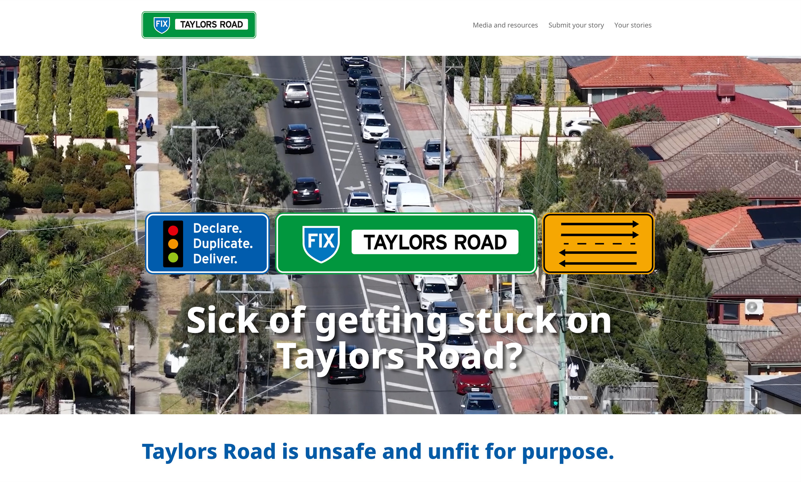
Like many places in contemporary Australia, Melbourne traffic is a commute headache. One particular hot spot is Taylors Road in Brimbank. The Brimbank City Council is campaigning to have the Taylors Road declared a major arterial road by the State Government. This declaration would see the ownership of this section of Taylors Road transfer to the State Government and allow for duplication. Improving traffic congestion and travel times significantly for residents and visitors.

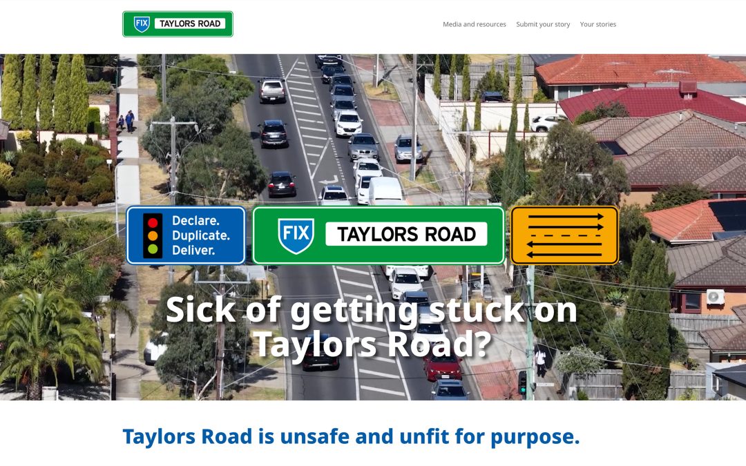
KRD was engaged by Brimbank City Council to create the branding for the campaign, and subsequent micro-site build.

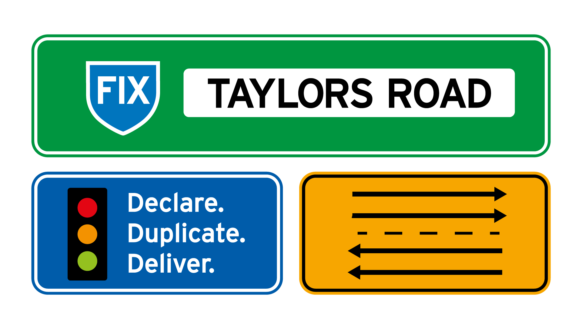
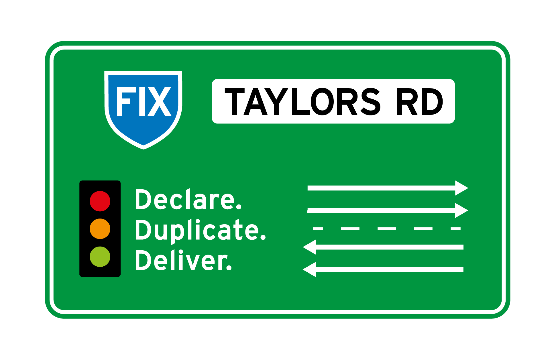
From brief to completion the project took eight weeks, with well-planned sequential project milestones. The campaign branding was developed first, with the brief requesting that the specific problem and solution be visually represented. As a council project, the end messaging needed to be clear and easy to read to a whole of community audience. Graphics used needed to communicate effectively to the large and varied multicultural community living and working in Brimbank.

Road signs emerged as a visual solution that suited both the 3-step solution – reflected in traffic lights – and the roadworks/warning sign format for lane indications. The shield holding ‘fix’ is used on Australian road signs. These familiar road symbols provided the perfect vehicle for the campaign messaging.

The micro-site was briefed with the requirement to collect and publish community stories to support the campaign. As a stand-alone microsite, we were free to use campaign colours and fonts. The site build was initially with supplied content, with space allocated for user generated content.

Working in WordPress with Divi editor, we found and adapted form plugins that allowed people to submit their stories and upload supporting imagery and even videos. We setup the framework to allow these submissions to be collected as user generated content and published to the site.

The Divi editor allows for block building of content placement with built-in responsive features, and we recommend it for all WordPress sites we build. The wide range of pre-coded blocks make designing intuitive and streamline development and content display features.

It is a pleasure to see the site build growing as Brimbank City Council add their news and resources, and the community submit their stories. It is always rewarding to see content management systems (CMS) websites grow and evolve as the framework we built fills with the addition of up-to-date content.

For a design team there is a wonderful sense of achievement working on a seamless project with timely client feedback. The opportunity to be involved in a project that mobilises the public for the benefit of a wide user group is greatly appreciated by all at KRD.

Mono Awards 2024

Mono Awards 2024

by Kym Ramadge, October 2024

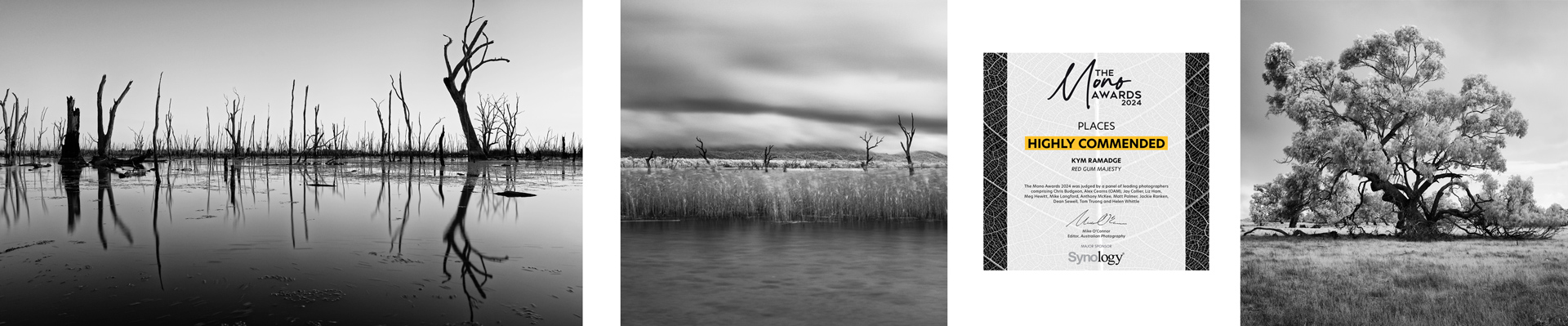
I am both honoured and humbled one of my black and white landscape images received a Top 30 Award in the 2024 Mono Awards, in the Places category.

The image is named Inside the Vortex and is an infrared, long exposure of the abandoned lime kilns at Walkerville South, Victoria.

As a professional graphic designer with 30+ years industry experience, I have at this point, seen many thousands of design projects I worked on, art directed or contributed to either, printed, manufactured or published in the digital sphere. Naturally, many of these have been special projects, close to my heart. However, this is the first time my personal creative work has been awarded and published in a national publication, side-by-side with extremely beautiful and artistic images by accomplished photographers.

Further, of the ten images I entered in the Mono Awards this year, six were Commended, three Highly Commended, with Inside the Vortex published at #28.


Infrared is a remarkable, intoxicating medium. I had an older camera body converted. This means the sensor was changed and the camera calibrated for the lenses I use. Infrared captures light our human eyes cannot detect. It is perfectly suited to black and white photography as it defines tones in an other-worldly outcome. For example, on a bright sunny day, it will turn the sky black. Foliage will turn white, reflecting the sunlight.

Inside the Vortex was taken during a windstorm. Anyone who knows Waratah Bay on the Gippsland coast will be familiar with the changeable weather patterns. Walkerville holds some of Victoria’s most prominent and ancient geology. There is always something new to experience at this location.

The Mono Awards launched in 2019. There are three categories: People, Places, Animals. 2024 marks the sixth year with over 3,500 entries.

The Mono Awards is a truly special showcase of the best black and white photography, and a celebration of the diversity of this wonderful genre.

The competition is run by Yaffa Media Pty Ltd, publisher of Australian Photography and Capture.

The Mono Awards

Published on LinkedIn here


Graphic design before desktop publishing

Graphic design before desktop publishing

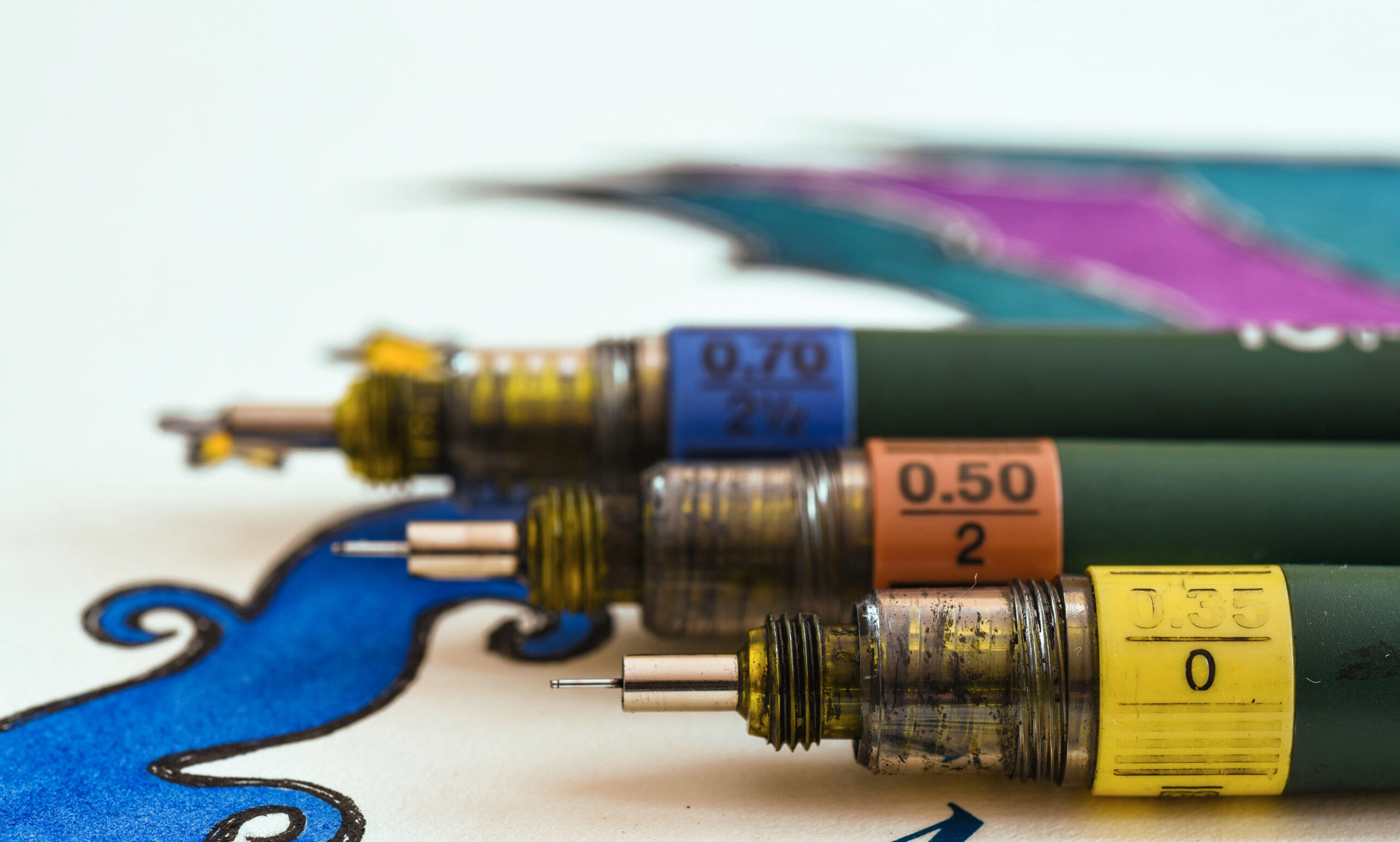
Cover image KR, featuring TG1 Faber Castell .35, .50, & .70 technical drawing pens, purchased 1989, sitting on 1992 final year illustration project.

by Kym Ramadge, February 2024

Our industry has a diverse, multi-stranded history full of fascinating and now, lost crafts and trades. Graduating on the cusp of desktop publishing ascension in the early 1990s, I was fortunate to witness the phenomenal change in technology sweeping graphic design and associated industries. This is a brief overview, each point could easily have in-depth research and an essay.

Many people are aware the advent of the Apple® Mac and development of software by QuarkXpress® and Adobe® was a revolution for creative industries, beginning 1984. The WSIWIG interface removed the need to learn ASCII or other clunky PC-based languages and the speed it replaced traditional typesetting and artwork creation was breathtaking, on the scale of the time.

But, how did graphic designers, commercial and finished artists work before this? What mysterious means were used to conjure up the printed material, film and television graphics, signage and all the other touchpoints of commercial advertising?

If you have seen Madmen or Darrin Stevens on Bewitched, you may have some insight, with Art Directors showing marker-rendered concepts to clients, working at an angled desk to make drawing easier. Prior to the ’90s there was a huge tactile part of work that is now, mostly, replaced by digital technology.

From left: Apple Mac II, 1984; QuarkXPress 3.2, 1993, Darrin Stevens in ‘Bewitched’, 1960s; Kellogg’s ‘Frostie Flakes’ 1960s ad; US Surfboard Championships 1965 poster, example of three colour artwork.

Here is 1960s footage from London inside Foote, Cone and Belding ad agency, (includes 1960s social values).

From 28 seconds, the inside of the studio is shown with the overhead desk lamps. Design students in the late 1980s–1990s had the same setup at university, with slightly newer desks. Professional studios were setup all over the world with similar layouts and furniture. Of course, by this time, the angled desks were barely used as we migrated to the computer lab with rows of Mac SE 30s.

Graphic design students were trained in methods to use in the professional workplace. They not only studied traditional Fine Art subjects such as Life and General Drawing, they were also taught how to use markers, overlaying the colours to carefully blend tones; paint with gouache, which is a flat paint for illustrations; rule lines with technical drafting pens; enlarge and expose artwork in the dark room to create bromides for paste-up; accurately hand-cut mockups of packaging with scalpels and use an Omnicrom CT 1000 hot foil colour transfer machine to apply colour to toner with heat.

These methods were primarily to have full colour mockups of design work for folios/presentation. This was the same both for design students, and in professional studios, before the widespread adoption of colour printers (either ink jet or toner-based laser printers). In the early 90s, colour printing meant taking a floppy disk or Zip Drive to the local copy centre, waiting, sometimes days; returning and paying for your prints.

To prepare an image for Omnicrom, the parts of the design, ie, text and image had to have toner to adhere to. The toner was either from a laser printer or photocopier. This forced the creative exploration of papers and best way to get the look the envisaged artwork required. A favourite technique of students to simulate gloss finishes was to use black paper, photocopy the pattern required on there and run through the Omnicrom machine with a clear cover sheet only, creating a gloss effect on the pattern. Pantone® colour sheets were used in the Omnicrom machine.

Left to right: Omnicrom CT 1000 machine, sheets of the Pantone® colour transfer film and machine with artwork being fed through.

Omnicrom machine in action on YouTube.

In our final year, 1992, we learnt the fine art of Cromatech. This involved creating separations for each colour required in the darkroom, mixing flat colours and using a silk screen with an underlay with adhesive. This was then applied onto the artwork to colour typography or other elements. Inside the darkroom was all analogue and included developer fluids and washing up facilities, as well as the enlargement camera.

Agfa is one of the large international companies involved in prepress, going back to the 1950s. With their history in photography, they were market pioneers in prepress, which all worked on analogue photographic principles. Pictured below left is an Agfa Repromaster designers and finished artists of the era will recall. The simple explanation is these machines were used for enlargements or reductions and to create separations of artwork into constituent parts. This step was prior to sending to a trade house for combining and setting the plates for offset printing. One challenge was keeping the glass at the bottom and at the top perfectly clean so as not to enlarge dust particles.

After the bromides were produced, paste up was the next step. This required using lined artboard, blue pencil (blue was invisible in the next prepress step), technical pens for line work and pasting the artwork into place. Accuracy and cleanliness were vital. Above are two photos from the 1960s showing paste up in progress. Pasteup also involved using Letraset sheets with text which was rubbed down into place. Letraset was a huge change when first released as it opened the range of available fonts and sped up the process of pasteup.

Also available were clip art books. These were used for decorative borders, simple graphics or in advertising in the same way stock graphics are incorporated into artwork today on certain projects. Instead of cutting up the Clipper book pages, the page was taken out of the folder, a bromide created, and then added to the paste up. Which is probably not what Clipper intended but likely a common practice in many studios.

Before the precision and ubiquity of digital full colour printing, there was far more use of special mixed colours for one, two and three colour printing. The Pantone® system was common. Paste up instructions for prepress would include putting a colour chip out of the book onto the side of the paste up, with instructions. Brands had (and still have) specific Pantone® colours to maintain colour consistency across all printed material.

All the materials referenced above were generally expensive and design students would save up for top-quality fine paint brushes to use with gouache; fiercely keep all scraps of Omnicrom, sharing with friends when you needed a scrap of colour; and keep coloured paper from previous projects.

The benefit of learning these methods back in the day was to comprehend the intrinsic link between the artwork design, prepress and all print outcomes. Designers had to understand setup for production. It demanded a rigorous attention to detail and meticulous fine skills. Of course, no one would deny the options available now in the digital world are far superior, in most ways, to old technology. Still, as letterpress type, film photography and vinyl LPs are all enjoying a renaissance, there is always the opportunity to incorporate some of these techniques, particularly in illustration work.

For those interested in further info:
Paste Up
How to Paste Up 1980s Style
When Letraset was King

Article on Omnicrom:

Printing Techniques: Omnicrom Hot Foil

Excellent article on working in packaging design in the early ‘90s in London:

Keeping it real