
by Kym Ramadge, May 2026.
One of the most rewarding aspects of a visual communication career – apart from the diverse and dynamic people I have had the privilege of working with – is the breadth of projects across a plethora of industries I’ve been involved with.
There are parallels between journalism and graphic design, where we learn about a multitude of sectors without ever deep diving, the way an academic would focus on one professional area of knowledge.
Where’s Eric! magazine
Ramblin’ on my mind
April 2020
28 years ago, I received a letter (you remember them) from a young graphic design student, offering her services in the design of this magazine. As she was based in Melbourne, Australia, I doubted it could possibly work, but she sent over A3 size spreads anyway and we just dropped them into the magazine from Issue 3. We worked together on and off for years and Kym Ramadge, for it is she, now runs her own highly successful graphic design studio. I am delighted to say she is back for us again and expertly designed this issue, putting up with the Virgoan idiosyncrasies of the Editor, plus late night/early morning WhatsApp calls.
As a young design student obsessed with all things Blues guitar, I spotted a small ad in a guitar magazine about a Where’s Eric! Fanzine. In 1992, before email adoption was ubiquitous, by the time I had seen the ad and written to the Editor in the UK, the first issue had been published. As Tony noted above in the April 2020 magazine intro, we have been working together on and off since then.
Starting out as a paste-up, photocopied fanzine, over the years the publication progressed first to colour cover and double spread inner, to the latest iteration, full colour throughout. As the world has evolved, the website and social channels have been added.
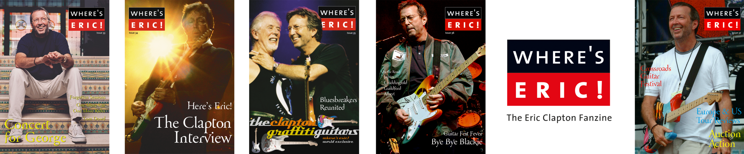
The current logo is an evolution of the original I designed in 1992.
Stand out moments
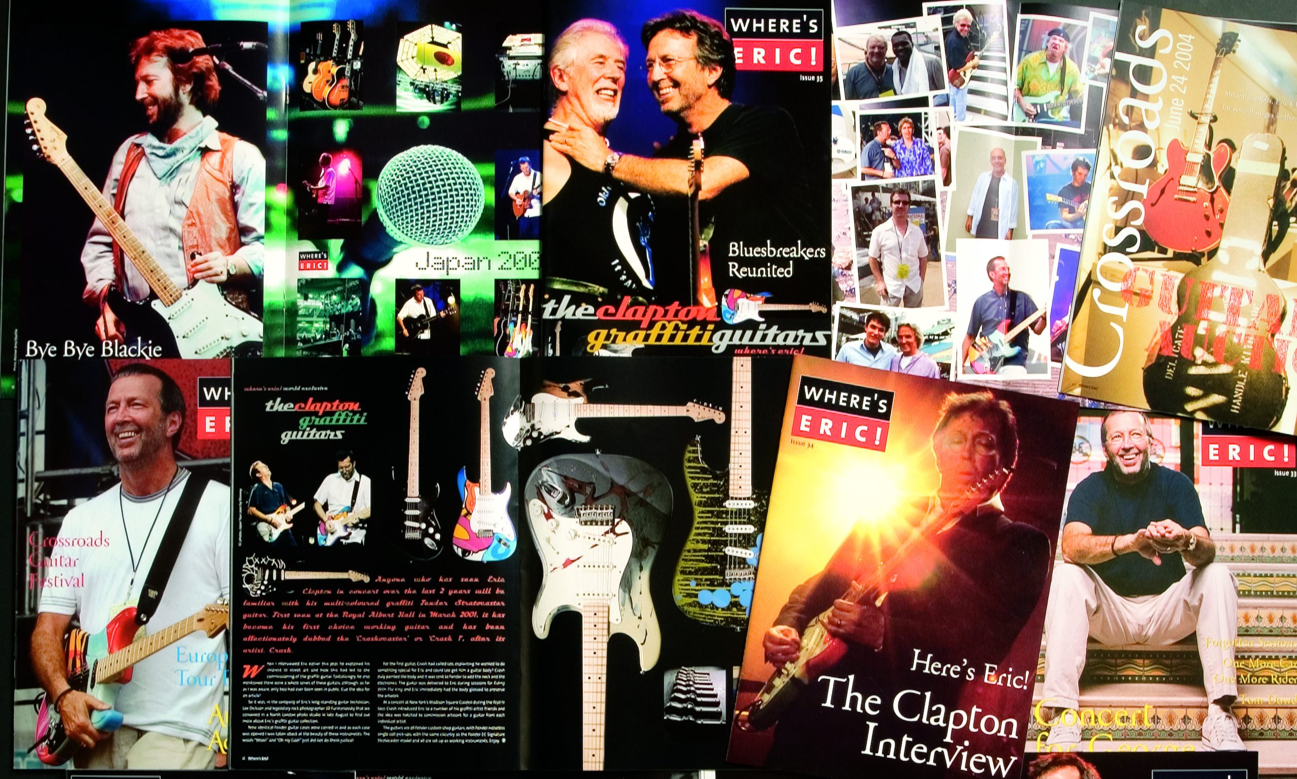
Through years of patience, quiet persistence and professional decorum, the Editor was rewarded with an exclusive in-person interview with EC in 2003. I had the honour of designing this issue (#34). Finding the right elements to present this with the gravitas and design flair it deserves consumed my spare time. One element included a spare electric guitar string coiled up, which I photographed and used as page highlight.
The following issue (#35) featured a special inner colour spread of the Clapton graffiti guitars. These are strikingly painted, individual artwork on each guitar, some of which were later auctioned off.
Issue 51 is another favourite. It features the beautiful 24 Nights artwork by Peter Blake. This simple, engaging linework retains a timeless eloquence, perfectly visually representing the music.

I have been in and out of the design role: Issues 33–37, Issues 41–42, the cover of Issue 46, then Issues 48– until the most recent, #54, are all magazines both myself and later, my team have been involved with designing.
Where’s Eric is a fun side-project for the studio, unbound by corporate brand guidelines and a welcome place for some whimsy, colour and quirky font choices. I’ve been friends with the Tony, the editor since 1992. We have continued a long-term musical journey together and explored many artists and genres beyond Blues and EC.
Now retired from his professional career, the Editor is working on rewarding philanthropic activities with Musically Fed, as well as continuing work on Where’s Eric!
On the Road with EC is a regular column. Design journeys travel unpredictable roads.
With special thanks to Tony Edser.
To learn more or subscribe to Where’s Eric!